Exhibition Review: Lito, tipo, calavera. Historias del diseño gráfico en Colombia en el siglo XX
For over a year, the Casa Republicana inside the emblematic Luis Angel Arango library in Bogotá, Colombia had on display the exhibition Lito, tipo, calavera. Historias del diseño gráfico en Colombia en el siglo XX.This is the first comprehensive exhibition about the histories of graphic design in the South American country during the twentieth century. The ambitious curatorial work by editor, and researcher Juan Pablo Fajardo, brings an aesthetic interest in typography and letterforms in dialogue with Colombia’s complicated political, social, and economical circumstances between 1900 and 2000.
The exhibition included several hundred examples of printed materials like currency, magazines, newspapers, labels, covers, illustrated books, logotypes, posters, signage, and catalogs among others. While the exhibition was organized with a chronological logic, it was divided into fifteen thematic chapters. Each one included stories and facts that contextualize the pieces, its creators —when known, printing technologies, aesthetic choices, and editorial perspectives. For example, the first two sections show currency design, regional periodicals, and humor magazines. These are framed in Colombia’s early 1900s precarity of resources, war, and early critiques to conservative governments and interventionism. A time where, as explained in the curatorial text, metal type made from lead was melted out to produce shrapnel for war material.
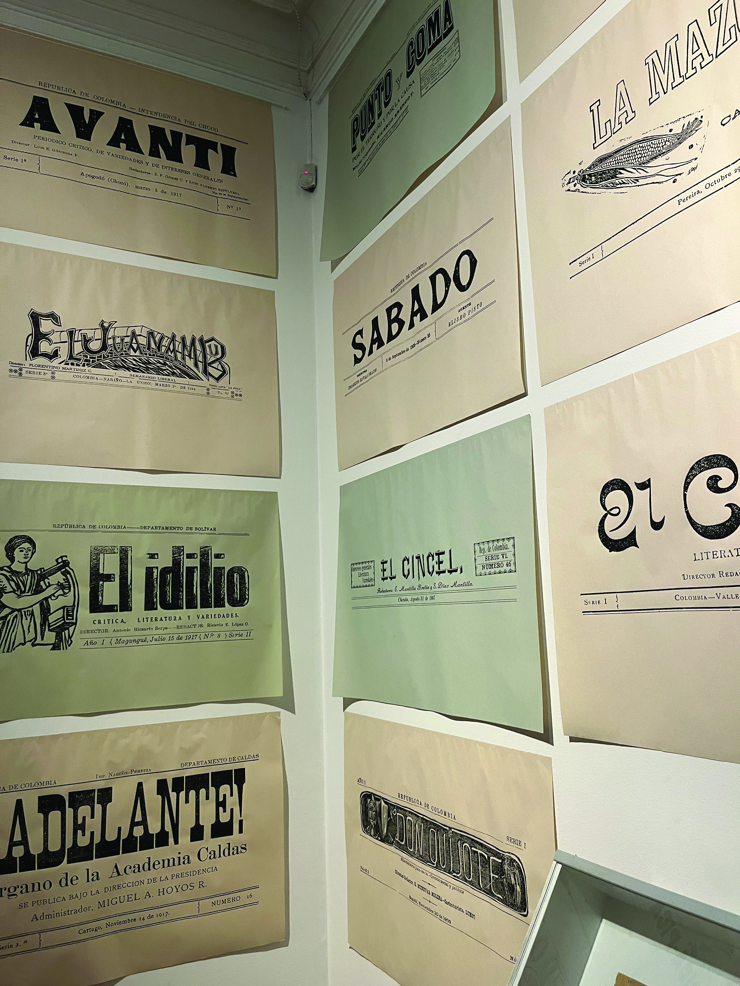
Enlarged mastheads from regional newspapers from the first decades of the 1900s occupy the walls of one of the exhibition’s rooms. These are characterized as early examples of visual identity evident in quite a few examples of custom drawn letters (figure 1). A typeface by Bastarda Type, a design studio based in Bogota, is on display. The type revival is based on the masthead of El Penitente, a periodical published in Cartagena, Colombia in 1907. A conversation between current design practitioners and this collection of historical artifacts can propel local designers to study and preserve them.
Twenty-five years after the end of the war, with the support of the government, the publication Colombia cafetera was published in 1927. The book, produced with the goal of seeking opportunities for foreign investment, contains general information about the country, coffee production and other exports. An exhibition room shows large prints of visually engaging infographics and typographic details from pages of the book (figure 2). As the exhibition continues, design activity tied to economic growth in the country takes the central stage. The history of the first commercial printers like Carvajal, founded in 1904 in the city of Cali, is told with a large selection of labels for products such as cigarettes, beverages, and perfumes. The visual identities for products between the 1920s and the 1960s are intertwined with stories on the import of machinery and expert labor from Germany to support the demand as the national industries grew and international interest and influence increased.

Examples of graphic production outside of commercialization of products have a strong presence in the exhibition. Pages of the political comic La gran mancha roja, commissioned by the government to document the murder of presidential candidate Jorge Eliecer Gaitan in April of 1948, are framed, and displayed on the walls. A collection of book covers designed by artists from 1920 to 1970 is arranged in a long wall with shelves. In another area, with the display of the conservative periodical Avante the curator unveiled stories on how the graphics supported political rhetoric and the dissemination of anti-communist messages. Aesthetics and politics appear as a recurring theme all through the exhibition along stories of the individuals engaged in the creation of the work.
Unsurprisingly, the history of graphic design in the country has been dominated by men. A section is devoted to Sergio Trujillo Magnenat (1911-1999), painter and illustrator considered a pioneer in lettering and typography in the country. Influences of art deco and other European movements are visible in his work. Some of the women whose work is included in the exhibition are Trujillo’s close friend Carolina Cárdenas, and his wife Sara Dávila. In the second half of the century some notable figures include Marta Granados, Camila Cesarino, and Susana Carrié. Other pioneers include David Consuegra, who was educated at Yale and worked with Paul Rand; and Dicken Castro, architect and graphic designer who also studied and worked abroad before coming back to Colombia. Their work is influenced by modernist thought and is still visible in visual identities that remain in use today. While Consuegra, Granados, and Castro practice under modernist principles the influence of local identities remains to be studied and unpacked in their work.
There is an effort in the curatorial work to include visual production performed by marginalized groups. For example, the 1949 book Nuestra gente “Namuy Misag”: tierra, costumbres y creencias de los indios guambianos en 1949, illustrated by the indigenous artist Francisco Tumiñá Pillimué and the inclusion of graphic signature of indigenous leader Manuel Quintín Lame (1880-1967). In the 1970s conceptual artist Antonio Caro reappropriated Lame’s signature as a symbol of the struggle of indigenous peoples in Colombia. Pre-Columbian design is mentioned through publications by Antonio Grass on the topic between the 1970s and 1980s. Is noticeable that in the exhibition there is no presence of afro Colombian visual culture despite representing over 9% of the country’s population. Other areas of exploration that are largely absent from the exhibition and usually are not found in official histories are vernacular typography and popular graphics. Research on the visual production of such a multicultural country composed of many regions is challenging. The missing spots are opportunities for future research.
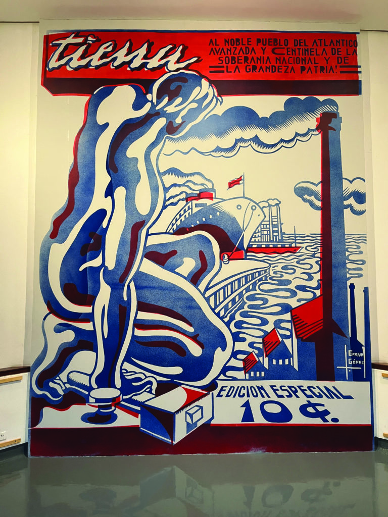
A wide array of topics is covered in the rest of the exhibition. Communist press is the theme of one of the sections which is centered in Tierra, periodical publication of the Colombian Communist Party in 1932. The work of the artistic director and writer Luis Efraím Gómez Leal (figure 3) is described as an aesthetic adventure by the curator. The exhibition continues with sections on signage on buildings, the work of Italian Rinaldo Scandroglio, Walter Gropius in the city of Jumbo, the first national graphic design exhibition in 1969, the visit to Colombia of designers like Herbert Bayer, Hermann Zapf, Milton Glaser, Ivan Chermayeff and Saul Bass. The experimental work between art and graphic production for political commentary is shown in the work of Taller 4 Rojo and the artists part of the collective Trabajadores del Arte Revolucionario TAR. Another section focused on the impact of the work of professional designers in the graphic production of cultural institutions like the museums of modern art in Bogotá and Medellín during the 1970s and 1980s. The precarity of resources that characterized the early part of the century comes back in a section about the 90s printed materials like fanzines and fliers for concerts representative of DIY culture.

The archival work and collaborations that preceded the exhibition unveiled materials that had not been exhibited or published before. The panoramic nature of the exhibition with its rich network of fragments opens multiple entry points of inquiry. Along with the catalog, they contribute to the construction of a corpus that lays a strong foundation for a historiography of graphic design in the country. As a field in its infancy, it can be built and invented with a pluralistic perspective transgressing the usual canon of graphic design history.
The exhibition was held in the Biblioteca Luis Ángel Arango, Casa Republicana, Bogotá, Colombia, September 28, 2022 – October 2, 2023


